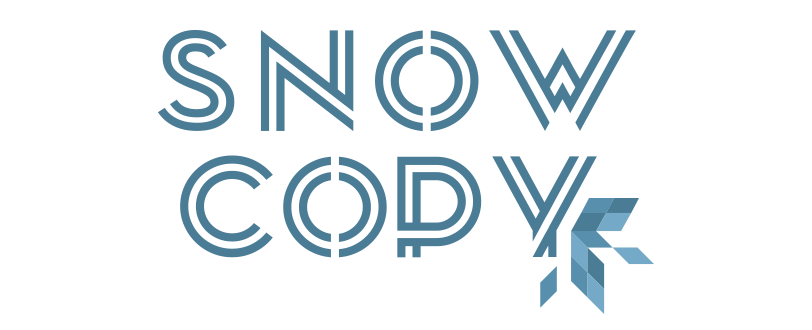
Snowcopy
Snowcopy is a new ambitious project by a young italian copywriter and web content specialist who work in Denmark, in Copenhagen city centre.
The project born after 6 years in web and SEO context and an education as journalist, with a passion for the scandavian countries.
From this conclusions, the message to send is the freshness of her ideas and to bring a breath of cool air in an old web landscape.
So, fresh ideas for the business and deep competence in the world wide web jungle, with a particular focus on the contents, the SEO analysis and the image of the social business page, for privates and companies.
The graphic design of the identity was inspired to the natural connection with the name: Snow.
I tried to find a new fresh font to combine with the illustration of the snowflake, but through a strong and solid message, without thin lines and floating letters.
We know that every flake is different from the other and the choice of the right shape to use, linked with this font, was not so easy and, after a lot of try, I had to forget the standard shape of the flakes and to focus also on the restyling of the frame.
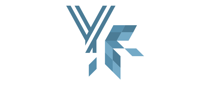
From here the idea to break down in geometric shapes the flake to sum up the frame. The result is a kind of bidimensional tassellation lowpoly, but without 3D effects.
The summary of the brand is the “Y” that become a flake, with no interruption with the armony of the linear font but with a trend to the illustration.
Visit the website with the button on the bottom of the page, or click here!
A special Thank You to:
Snowcopy